Installation
To start using the components of MHD-UI library , kindly add the below external CSS link to your html file
Avatar
Avatars are used to create a visual associaton of the user. It's displayed next to the account name, posts and comments.Letter avatars are used in absence of user image.
Image Avatar

Letter Avatar
AB
XY
EN
Icon Avatar
Alert
Alerts are for user's attention which carry important information that does not interfer the user's task. Each alert has it's own significance
This is an error alert
This is a success alert
This is a warning alert
This is an info alert
Badge
Badges on an icon or avatar is used to depict the state of the respective items.Badges maybe numbers on an icon or solid colors on avatars.
Badge on icons
Badge on avatars
Card
Card is mostly used UI component in ecommerce sites .It contains inter-related informations.It has the content and its associated call to action to single subject.
Card with badge

Card with dismiss
Image with text overlay card
Text only cards
Horizontal Card
Card with shadow
Product Card
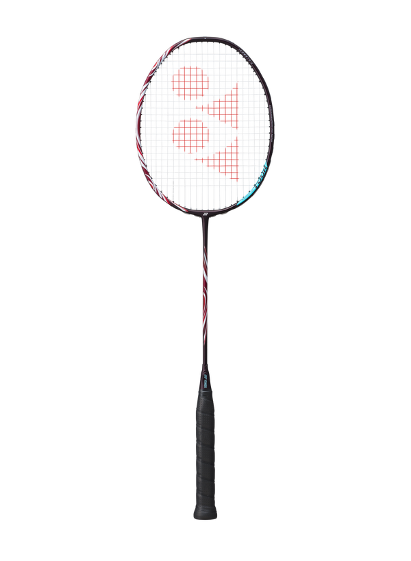
₹5,799
Horizontal Product Card
₹5,799
Responsive Image
Density Switching
Density switching technique is used to load images on devices based on their DPR(Device Pixel Ratio) so that the performance is enhanced while loading image.
Resolution Switching
Resolution Switching serves images based on the viewport size of the device.
Art Direction
In Art Direction technique the image is displayed according the mode(landscape or portrait).
Round image
Input
Input text
Input with error message
Invalid password. Try again
Input with success message
Valid password
Text Utility
h1 - Heading
h2 - Heading
h3 - Heading
Grey Text
This is a grey text
Centered Text
In id molestie justo. Aliquam blandit risus lorem, quis bibendum enim dictum et. Aliquam at tortor bibendum, posuere leo vel, venenatis libero. In pulvinar eget odio et auctor. Sed sit amet
List
Unordered list
Unordered lists are those lists which are not numbered rather they have bullet points in different shapes.
- List item 1
- List item 2
- List item 3
- List item 1
- List item 2
- List item 3
- List item 1
- List item 2
- List item 3
Ordered list
Ordered lists are sorted on numerical order, alphabetical order or roman order.
- List item 1
- List item 2
- List item 3
- List item 1
- List item 2
- List item 3
- List item 1
- List item 2
- List item 3
- List item 1
- List item 2
- List item 3
- List item 1
- List item 2
- List item 3
- List item 1
- List item 2
- List item 3
Notification list
-
New message from Rohit
-
Weather Update : Isolated Thunderstorms expected
-
File "image1.jpeg" has been uploaded
Navigation
Simple navbar

Modal
Modal is a window that prompts user to call to a action or to enter informations.
Are you sure?
The files would be deleted permanently.
Javascript
Rating
Rating is powerful tool used for product reviews in review section.
Javascript
Snackbar
Snackbar provides a brief message about the process at the bottom of the screen.
Javascript
Grid
Grid is a two-dimensional layout.Items could be placed explicitly or implicitily in the grid. It helps to build complex layouts.
Grid: Two column layout
Holy Grail Layout
Navigation with Submenu